For the most part, something constructed in the Microsoft Design language is built with dark backgrounds and white text in the Segoe UI typeface. The Segoe UI family is a sans-serif font, which is more easily read in the digital medium.
Large type represents the top of a hierarchy of text, such as a heading. Sometimes all caps or all non-caps can be used to represent an identity as an element in the interface, rather than a piece of copy or part of a body of text. Elements are generally oriented from left-to-right rather than centered, although there can be exceptions. General guidelines: if you want something to look like the Microsoft design language, think simplicity, iconography, typography, motion, and flatness. Utilize contrasting colors and align margins of elements in the medium so it looks clean and organized. Only use movement to enhance the role of the design element, not distract from it. For example, text flipping back and away to make room for new content can convey progression or advancement. Don't use gradients, and make sure to use transparency in icons. Don't grab any old image off of the internet because it will most likely be a picture on a white box. Search for PNG images that support transparency, and pick high resolution images when at all possible. Use full-sized images to convey effect! They're worth a thousand words, after all. When in doubt, strip it down, make it shorter, or simpler. Use simple, flat icons to represent ideas. Be consistent in your arrangement and clear in your visual language. Remember, the design language is digitally-authentic. This means it is the polar opposite of UX skeuomorphism (a design principle that takes cues from applying a "realism" approach to digital UI by making elements appear or mimic physical, real-world objects or material). This is my interpretation of the design language, and does not necessarily reflect any of Microsoft's thoughts on the matter.
0 Comments
If you're a #WinPhan, chances are you've already downloaded the Windows 10 Technical Preview Microsoft pushed out today to Insiders.
You'll notice many differences from Windows 8.1 to the Preview of 10, and one of them is the set of folder icons. However, not all icons are "modernized," such as the users folder, search folder, and others. So I took it upon myself to create icons myself that matched the same style. You can download the official Windows 10 Technical Preview icons as well as my custom icons below: 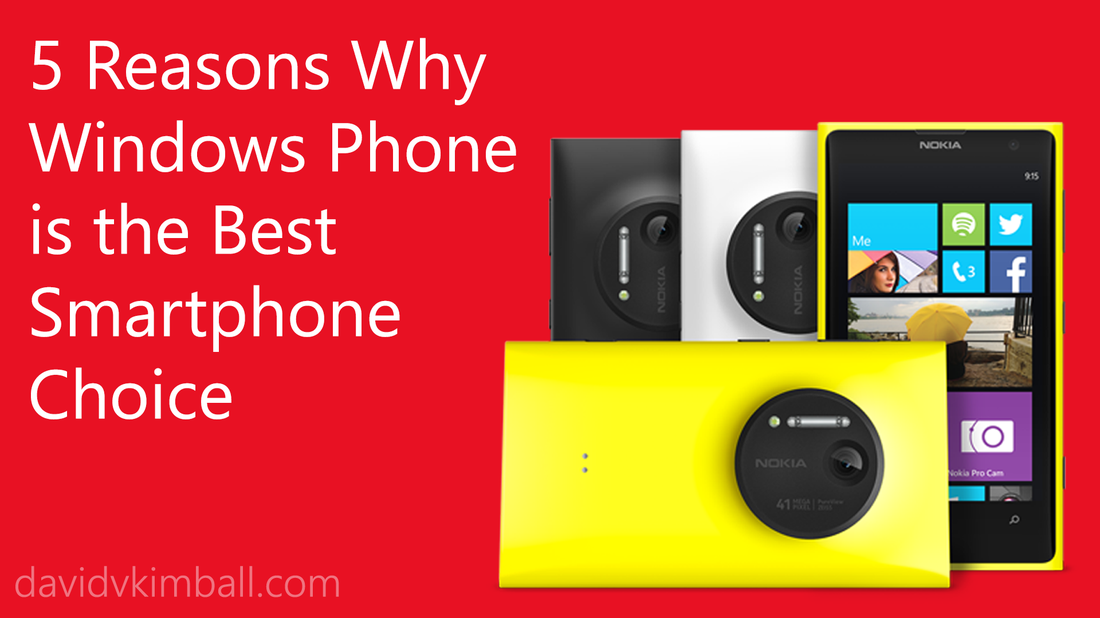 So what makes Windows Phone stand out from the rest? Here’s the concise rundown: 1. It's fast.Windows Phone’s UI is designed to get you where you want to be as quickly as possible. Live tiles provide the user with a dynamic glance-and-go experience. 2. It's feature packed.The default applications on Windows Phone are deeply connected with the services you care about like Xbox Games, Microsoft Office, OneDrive, and more. Cortana, the personal assist AI of Windows Phone, is there to help you set reminders, send texts, find restaurants, and more with your voice. 3. It's socially connected.Facebook, Twitter, and LinkedIn are deeply integrated into the OS, which makes sharing easy. Finding a friend’s recent status update is just a glance at their contact card on your phone. 4. It's personable.Your Start Screen is entirely yours to customize, with a variety of tile sizes and an array of colors from which to choose (or even choose a custom background image that defines you). Your favorite apps and the people you care about are right where you need them. 5. It's photo friendly.Each Windows Phone device has a shutter hardware button on the side for instantly capturing a moment. Snapping a photo is just a button away no matter where you are. Not only do some Windows Phone devices take outstanding low-light photos, the lens features makes editing and adding filters to your pictures seamless. 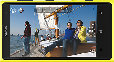  Today, a new leg of my journey begins. I am happy to announce that I am now part of Presenter Group: a Microsoft vendor dedicated to wowing and amazing audiences with the presenting of various Microsoft technologies. In about a month from now, I will be traveling across the country with an elite team of evangelists and presenters and will be showcasing Windows Phone 8.1 and Windows 8.1 Update 1 to Microsoft's clients and partners. There is much more to come, so stay tuned. Travel Blog: Follow it!Edit: I just launched my travel blog, which will be detailing my adventures with Microsoft starting on May 19th and continuing until June 6th. Visit the blog here!  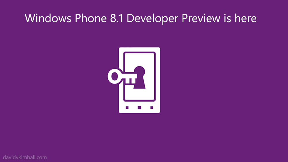 Windows Phone's next iteration is here. This update includes an Action Center to manage your notifications, a swype-like functionality for the keyboard, a digital personal assistant named Cortana, and more (you can see the rest of the features here). How to get the update
Do keep in mind that updating your device early can potentially void your warranty. 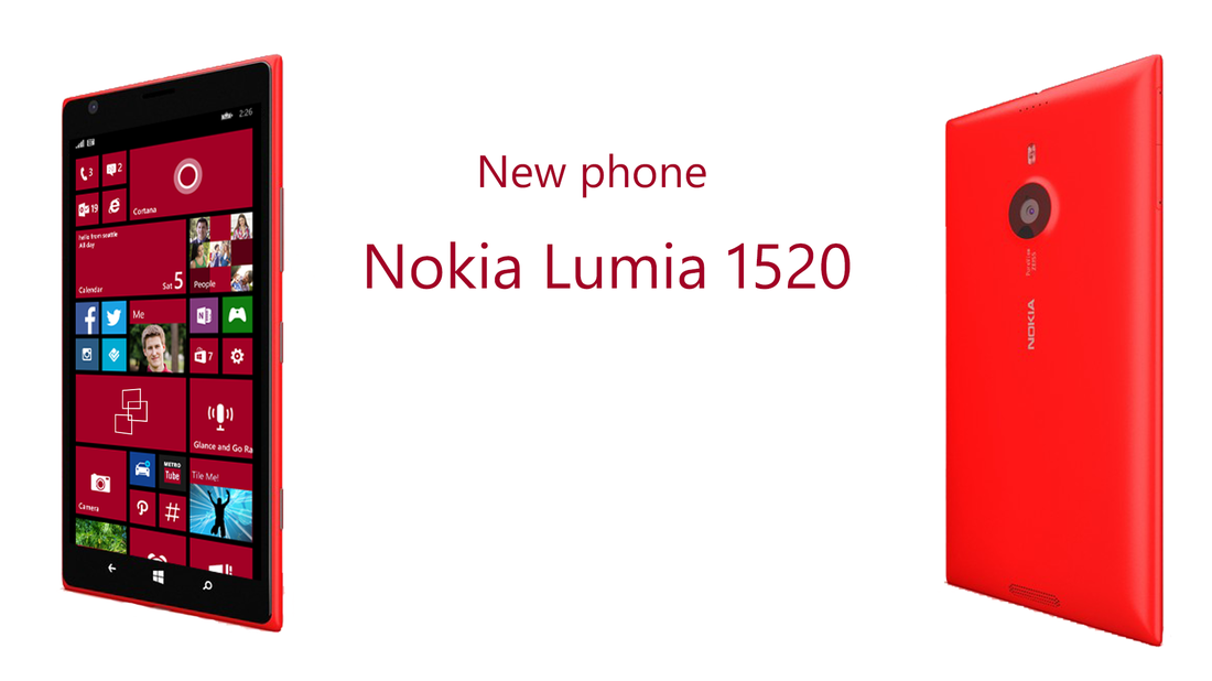 It's official! My Nokia Lumia 1520 handset came in the mail today. I'm delighted, because now this means I can use my Lumia 1020 and 1520 concurrently to make Windows Phone videos. I'll be making app reviews and lots of other kinds of content soon. You'll be able to see everything I upload here on my YouTube channel. Nokia Lumia 1520 - It's massive!Although I've had the opportunity to use the 1520 before, getting it out of the package today was a quick reminder how large the device is. With a 6 inch screen, its display is very easy to look at. And the best part is, this phone actually fits in my pocket.
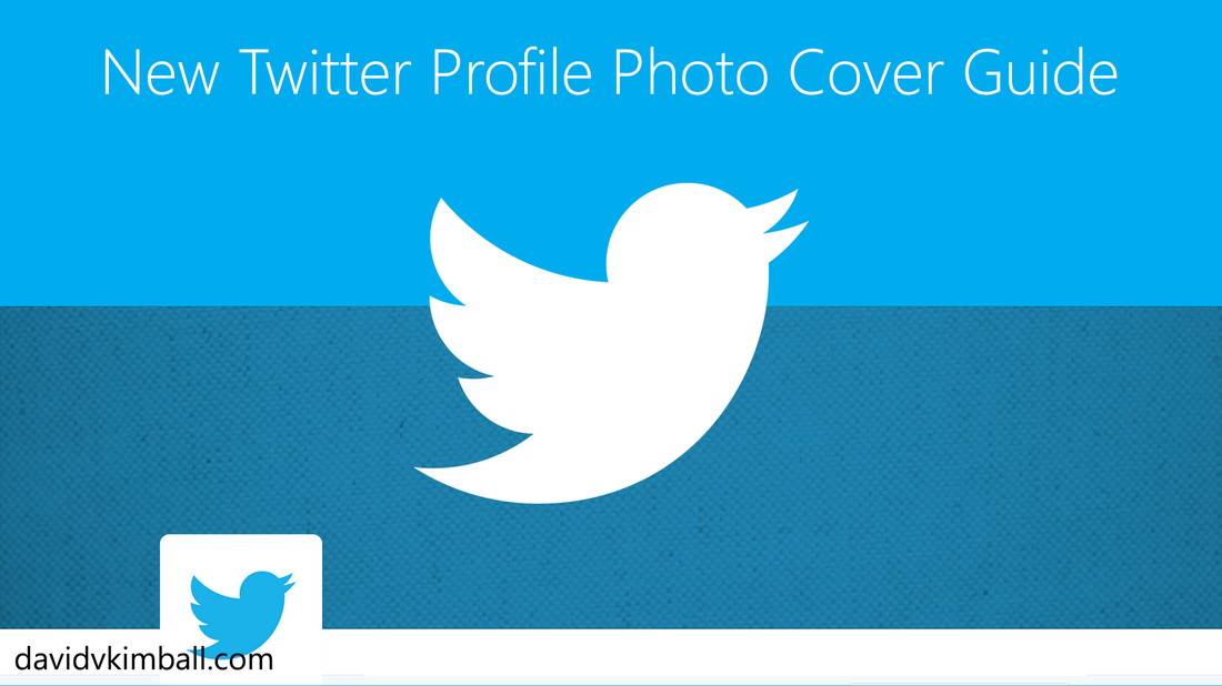 Twitter's profiles have updated yet again! For any of you Tile Me! users out there, this may come as a frustration to you, as you've decorated your Twitter backgrounds with images your Windows Phone, Start Screen, and features. Well do not fear! Ertay Shashko and I have been working hard to make sure Tile Me! will still work with the new Twitter Cover Photos. Formatting GuideIn the past, designing backgrounds for Twitter profiles wasn't that difficult. You aligned the image either left, right, or center, and make your background off of that. Now if you're designing your own Twitter Photo Cover, you're going to need to know more specifics. Let's get started.
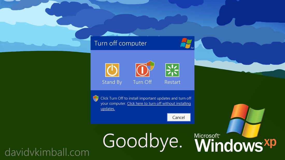 Thank you to deviantArt user Star784 for both the Modern "Bliss" background and the Modern XP "shut down" concept used in this post's header image. April 8th, 2014 is the day that all Windows XP users and Office 2003 users will no longer receive support for their products. It's time to upgrade!
What has Microsoft done to get people living in the past to take action? Well for one, they're offering $100 off select Windows 8 PCs. That's a pretty good deal if you ask me. Also, if you're desperate for a newer version of Office, you could try Office Online. 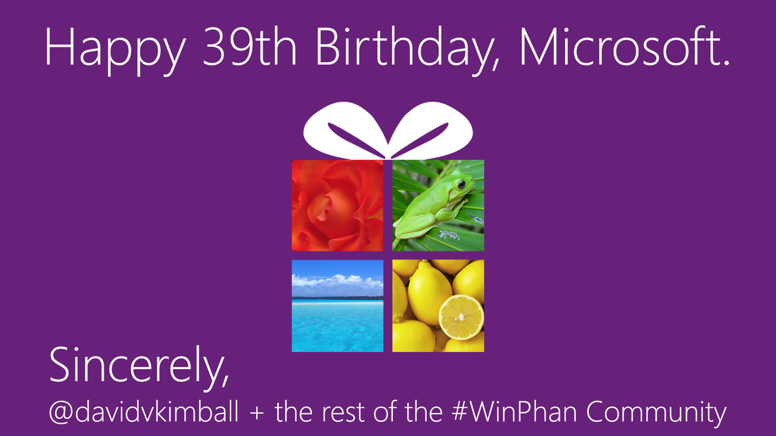 From me to you, Microsoft: a warm-hearted "Happy Birthday!"
Thank you for empowering people around the world with innovative technology and for all of the time, treasure, and talent you've contributed to humankind. Sincerely, David V. Kimball |

AboutI write about tech, social media and branding. Opinions are my own and do not necessarily reflect any of my employers' thoughts. Subscribe

Categories
All
Archives
August 2015
|
