For the most part, something constructed in the Microsoft Design language is built with dark backgrounds and white text in the Segoe UI typeface. The Segoe UI family is a sans-serif font, which is more easily read in the digital medium.
Large type represents the top of a hierarchy of text, such as a heading. Sometimes all caps or all non-caps can be used to represent an identity as an element in the interface, rather than a piece of copy or part of a body of text. Elements are generally oriented from left-to-right rather than centered, although there can be exceptions. General guidelines: if you want something to look like the Microsoft design language, think simplicity, iconography, typography, motion, and flatness. Utilize contrasting colors and align margins of elements in the medium so it looks clean and organized. Only use movement to enhance the role of the design element, not distract from it. For example, text flipping back and away to make room for new content can convey progression or advancement. Don't use gradients, and make sure to use transparency in icons. Don't grab any old image off of the internet because it will most likely be a picture on a white box. Search for PNG images that support transparency, and pick high resolution images when at all possible. Use full-sized images to convey effect! They're worth a thousand words, after all. When in doubt, strip it down, make it shorter, or simpler. Use simple, flat icons to represent ideas. Be consistent in your arrangement and clear in your visual language. Remember, the design language is digitally-authentic. This means it is the polar opposite of UX skeuomorphism (a design principle that takes cues from applying a "realism" approach to digital UI by making elements appear or mimic physical, real-world objects or material). This is my interpretation of the design language, and does not necessarily reflect any of Microsoft's thoughts on the matter.
0 Comments

You know the type.
The type of people that, when searching for an online video type "google.com" into their Ask search toolbar on their web browser, click the first search result (Google.com), types in "youtube," clicks the first result (YouTube.com), and then finally types his/her search query. If you didn't see a problem with that, you might be one of them yourself. Here's how to work with the technologically handicapped: 1. Start from the beginning. Yes, in some cases, this may even entail the inclusion of “Turn on the computer.” You can’t assume they know anything if you want to be the most helpful. If they’re glaring at you, however, that may be an indicator that they believe you are insulting their intelligence. If this occurs, simply ask them how they would do it, and pick up from there. 2. Listen. While you think you may be being very helpful with your articulate, beautifully-executed explanation, it may be going completely over their head. During your explanation process, be sure to check up on them once and a while with questions like, “Does that make sense?” or “Is anything unclear?” Also, allowing them to reiterate what you said in their words is a helpful clue to see if they understood you. 3. Avoid abbreviations, acronyms and other tech jargon at all costs. They're just not going to get it. Instead, go along with their strange explanatory metaphors. If you’re following steps 1-2 correctly, at some point the light will go on and the person you are helping will say something like, “Oh, so it’s like a car, and you’re just filling the gas tank!” …Although their oddly-worded reiteration might not always make sense to you, do your best to interpret it by asking them questions. “OK, what about this is like filling a car’s gas tank?” Although their “Eureka!” moment didn't quite click with you, it did click with them. And THAT is the beginning of true progress. 4. Make them practice. Even if you think they heard you and seem to understand everything you've just told them, let they try it themselves before you move on. They might have heard you wrong or you could have misspoken. One of the best ways to learn is by experience,so observe them as they give it a go. 5. Keep in mind: they probably know more than you in a different area. Before you get frustrated, remember that while they may be ignorant about computers, you are probably just as ignorant in another area and you should continue to be gracious to them. There are many brilliant men and women that are just as ignorant about computers as the person you are helping. So the next time someone says, “How do you find your favorites on the computer? I left-clicked the 'e' but nothing happened…” for the fifth time, don’t allow your blood to boil, instead, kindly lend them a hand using the five steps above. 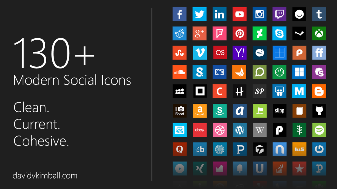
Fellow Microsoft Design Language fans, wouldn't it be great to have an entire set of current social media icons that reflected the flat, simple design we love? Well look no further, they're right here and PhotoShop'd by yours truly. There's over 130 of them (you might not have known there are that many social networks out there). If I've missed any, please suggest some. I take requests! Download them on my DeviantArt page! 
 Let's face it, people in 2015 are barraged with information. In fact, the amount of content shared online each year is doubling.
This means you need to stand out. But what sets you apart from the average Joe? You need to be more than just a person, you need a to be a brand. People need to think of Joe Blo as Joe the Trumpet Guy, or Joe the Cruise Coordinator. Brands give you an identity, a set of goals, and lots of opportunities. What is your brand? Think about your passions. Think about what you want to be known for, or what you want to be associated with. I want to be known as an advocate and evangelist, a persuader, and an influencer. I want to be associated with technology, social media, and networking. This is how I built my brand. You can do it, too. If in doubt, ask friends and peers what they associate you with, or have them tell you what you are passionate about. Try to make your brand niche. "Bob the worker" is too generic. Use a combination of your skills and passions to give you a unique spin. Make people think of you as "Bob the comedic caterer" or "Bob the financially-secure environmentalist." Once you find your brand, embrace it. Steep yourself in it. Become active in communities relating to it. Write on it. Connect with others that share similarities with it. Here's an article I wrote with more information on utilizing your passion to network with others. Find your brand and start engaging with it now. Have a question or just want to say hi? Send me a tweet. 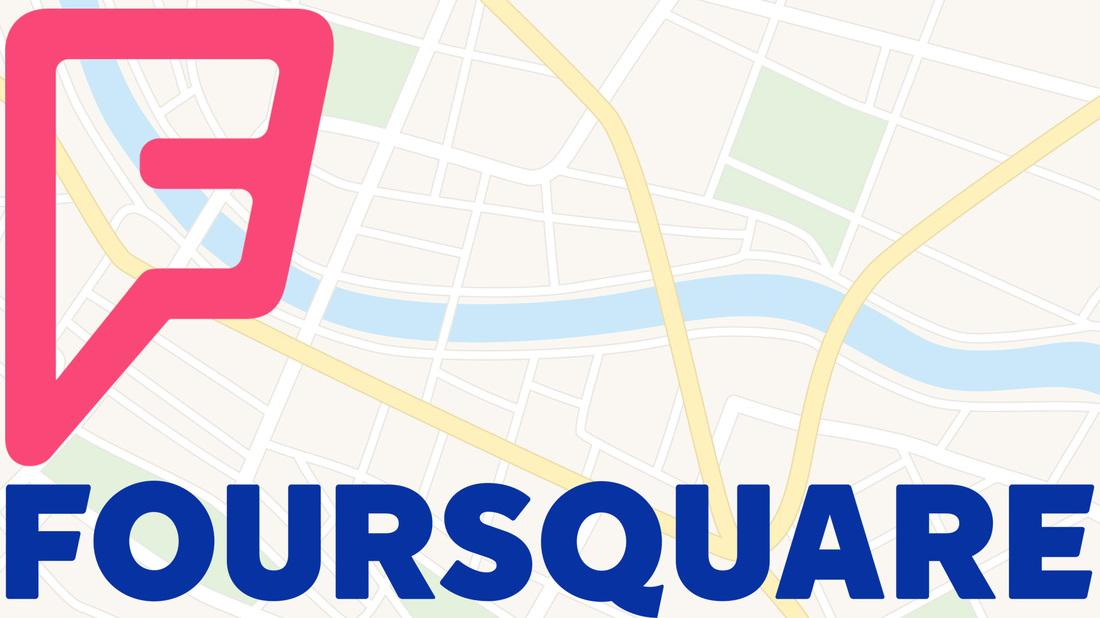 When Foursquare came out in 2009, I was a huge proponent of the service. Checking in was cool for keeping track of places you've been and seeing where friends are. The discounts and leaving tips were also amazing features.
I always felt it was extremely underused by the general public. That may be why they recently changed to become more of a Yelp service, simply as a database indexing businesses with tips from users, reviews, pictures and other content, but the "check-ins" component of it is gone. Instead, Foursquare made an app called Swarm to replace that function. Now transitioning a Foursquare account to Swarm is surprisingly easy, but one must ask the question why have a separate app? What's wrong with the check-in service being integrated in Foursquare like it was in the first place? The rationale could be Foursquare is for finding specific places and Swarm is for seeing where your friends are and what they're up to. But I still don't fully understand it. Since Swarm, even less users have been checking-in I feel, and almost no businesses support the check in Specials anymore. I find it to be tragic! What do you think? Were you a Foursquare user? So right now I'm going to start being more raw.
Less polish, more content. Less worrying, more writing. As a college graduate, I'm going to reengage with social media like never before. And I want you to be on that same ride with me. Here's to a heavily interactive 2015. Have a question or just want to say hi? Send me a tweet! 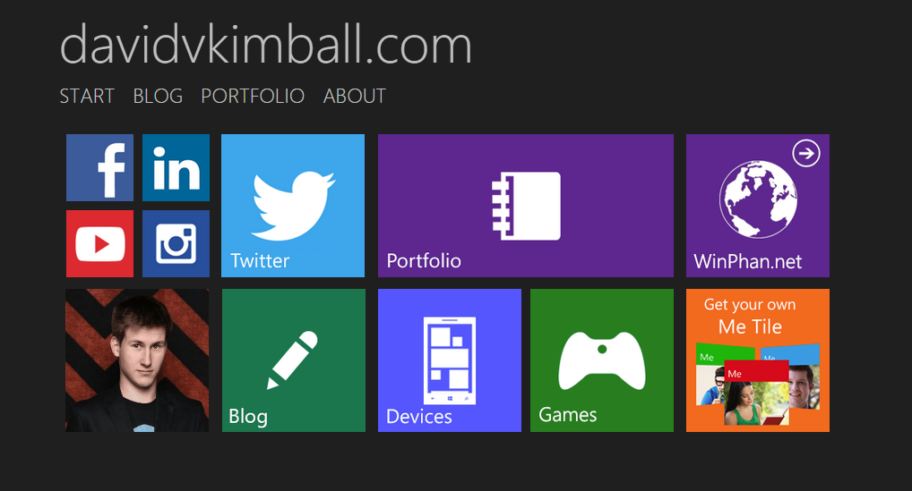
Because live tiles play a significant role in the Microsoft design language, I thought I'd make some livelier ones for my website.
Try hovering your cursor over this tile:
Pretty neat, huh?
Each tile on my website's Start page now has an animation (except social media icons). I've also updated all of the pages with the most up-to-date information. If you'll notice, I now have a prominent "Twitch Streaming Schedule" sections under games. I've begun streaming on Twitch! Please follow me here if you're a user and tune in on Mondays at 7pm (the first stream is tomorrow!).  |

AboutI write about tech, social media and branding. Opinions are my own and do not necessarily reflect any of my employers' thoughts. Subscribe

Categories
All
Archives
August 2015
|
