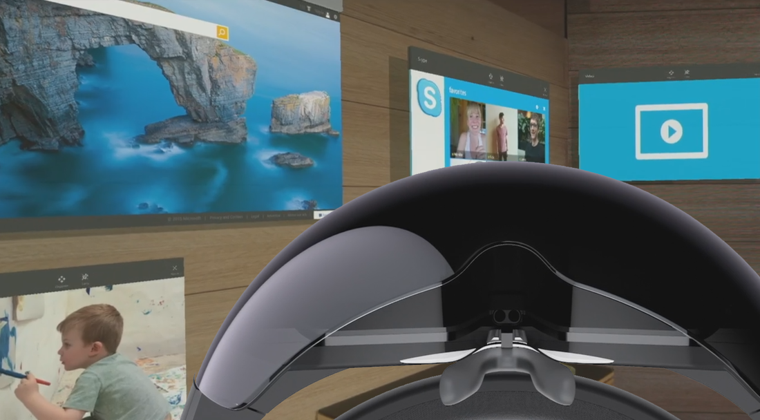
 The "new" Microsoft is growing out of its adolescent stage. Post-Vista Microsoft has been stepping up its game in the consumer space by making authentically-digital software and even entering the world of hardware with Surface and Lumia. Part of this re-branding was a significant aesthetic shift from glossy icons to flat, minimalist design elements. A difficult part of this shift was convincing consumers that this change was good. Some decried Microsoft's UI and UX change to flatness, simple icons, and minimalism, calling the look "childish" or "a regression." However others championed Microsoft's new image and celebrated it as the modern look and feel other tech companies ended up mimicking. Now it seems this UI change has paid off with HoloLens. Why? Now the only way to differentiate holograms and scrolling menus and/or floating screens is their perceived depth. Flat icons and menus assist the HoloLens wearer in distinguishing between text and menus from 3D hologram objects. For example, in this image below shows navigating a flat menu with HoloLens: 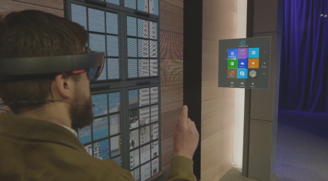 And here's an example of 3D hologram objects existing in a space. 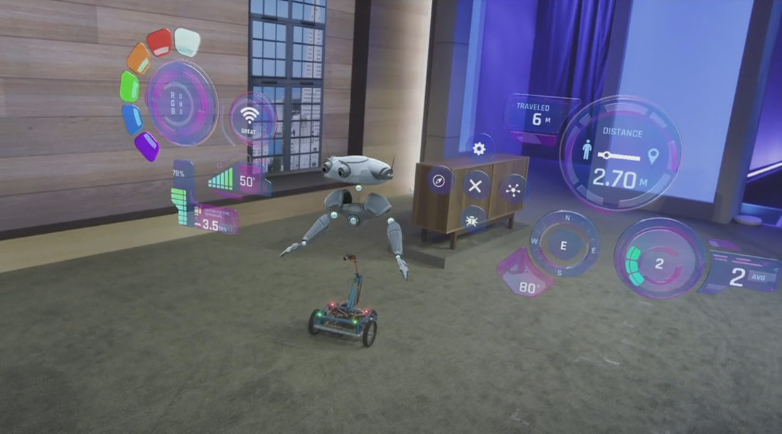 Now flatness can be associated with touch screens and simple hologram menus while 3D UI elements can coexist with 3D holograms and the physical environment.
Tl;DR: Microsoft's flat design works well with HoloLens because it contrasts beautifully with any 3D hologram elements being projected.
0 Comments
 Everyone's favorite conference is hours awayMake sure and watch live!
The conference starts at 8:30am Pacific Time. http://www.buildwindows.com/ |

AboutI write about tech, social media and branding. Opinions are my own and do not necessarily reflect any of my employers' thoughts. Subscribe

Categories
All
Archives
August 2015
|
